Netbet
At GIMO, I lead the visual design for NetBet Sports, ensuring all elements align with the brand’s identity. My main focus areas include user interfaces, design systems, and artwork, such as acquisition and print campaigns. I create engaging and intuitive designs that resonate with sports enthusiasts and drive the platform’s overall design strategy.
UI Design
UI Design


Working with variables
Working with variables
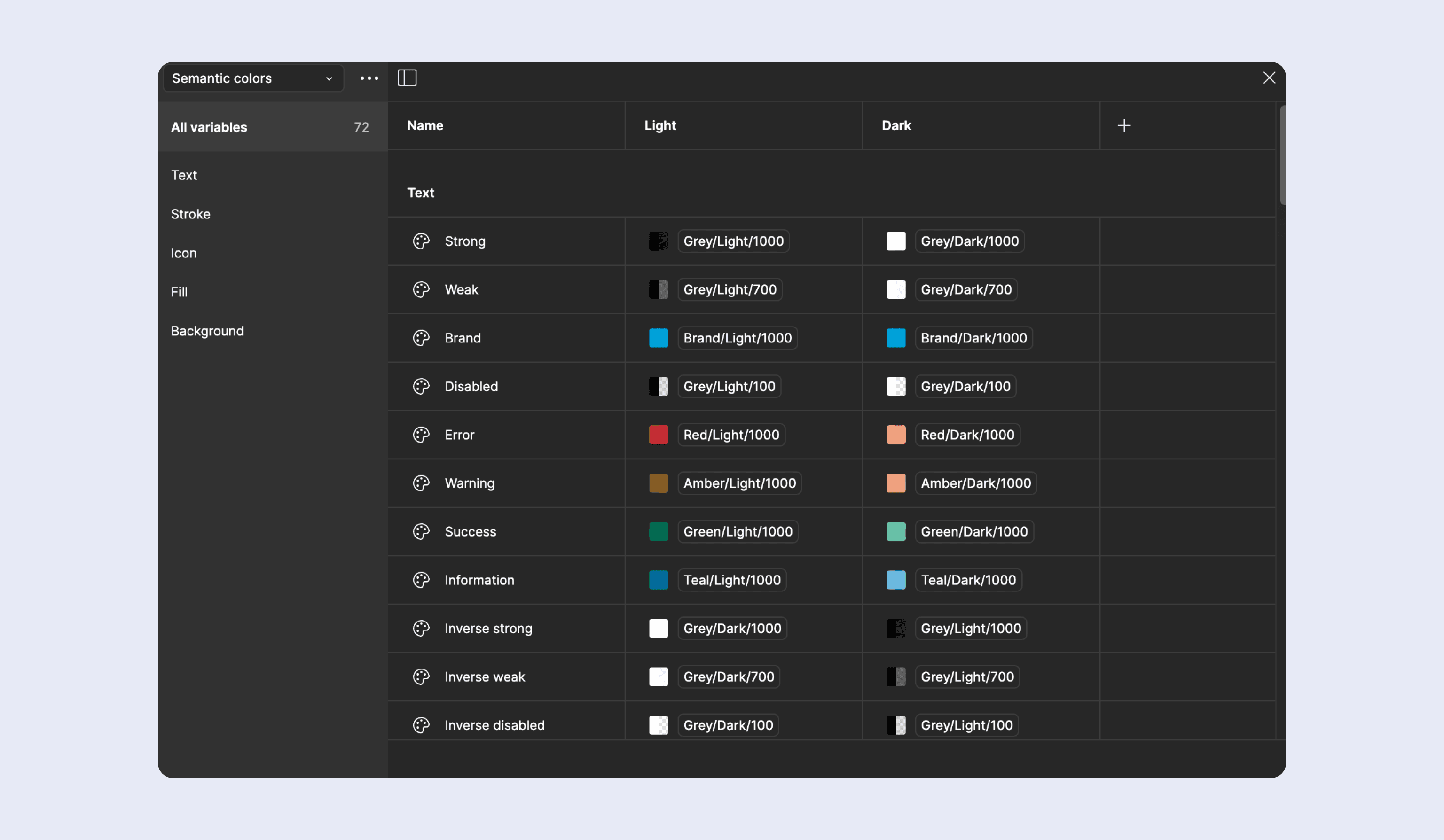
Visual Coherence: Achieves a consistent user experience by assigning distinct colors to various functions, such as errors, successes, and warnings.
Light and Dark Mode Adaptation: Utilizes variable modes to seamlessly transition between light and dark themes, minimizing the need for additional colors and simplifying the implementation process.
Scalability: Enables the integration of new colors or themes while preserving the consistency of the existing design framework.
Implementation of Design Variables: Streamlines the design process and ensures uniformity by applying variables for spacing, corner radius, and typography. This approach allows for the efficient application of consistent styles across the design system, facilitates easier updates, and maintains design coherence throughout the project.
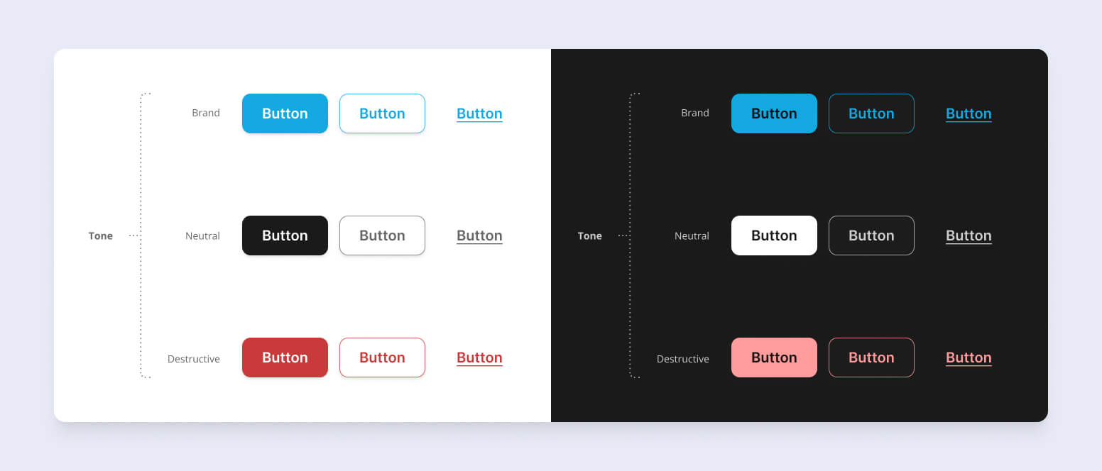
Consistency Across the Platform: The new button scheme ensures a uniform look and feel.
Established a clear hierarchy for buttons, with primary for key actions, secondary for supportive tasks, and tertiary for less critical options, aiding user decision-making.
Neutral and Destructive Actions: Introduced distinct tones for neutral and destructive actions, ensuring users can easily differentiate between regular actions (e.g., canceling) and critical actions (e.g., deleting), reducing the risk of accidental actions.
Improved Accessibility: The button scheme has been designed with accessibility in mind, featuring high-contrast color options and clear labeling to ensure all users, including those with visual impairments, can navigate the platform effectively.


Redesigned buttons
Redesigned buttons
Consistent Design: The new button scheme ensures a cohesive visual experience across the platform.
Clear Hierarchy: A well-defined button hierarchy designates primary buttons for key actions, secondary for supportive tasks, and tertiary for less critical options, enhancing user decision-making.
Differentiated Actions: Neutral and destructive actions are clearly distinguished, reducing the likelihood of errors.
Enhanced Accessibility The button scheme is designed with accessibility in mind, featuring high-contrast color options and clear labeling to ensure that all users, including those with visual impairments, can navigate the platform effectively.
Consistency Across the Platform: The new button scheme ensures a uniform look and feel.
Established a clear hierarchy for buttons, with primary for key actions, secondary for supportive tasks, and tertiary for less critical options, aiding user decision-making.
Neutral and Destructive Actions: Introduced distinct tones for neutral and destructive actions, ensuring users can easily differentiate between regular actions (e.g., canceling) and critical actions (e.g., deleting), reducing the risk of accidental actions.
Improved Accessibility: The button scheme has been designed with accessibility in mind, featuring high-contrast color options and clear labeling to ensure all users, including those with visual impairments, can navigate the platform effectively.


User panel
User panel
More elegant, organized, and intuitive design to enhance visual appeal and usability.
Search feature within the panel to help users easily find answers to their questions or navigate the panel.
Implementation of a notification system with direct access to support to keep users informed and enable efficient problem resolution.
Additional information panel to guide users and provide relevant assistance and details during their use of the panel.
Highlighted balance for clearer and more effective control over their account and funds.


Registration form
Registration form
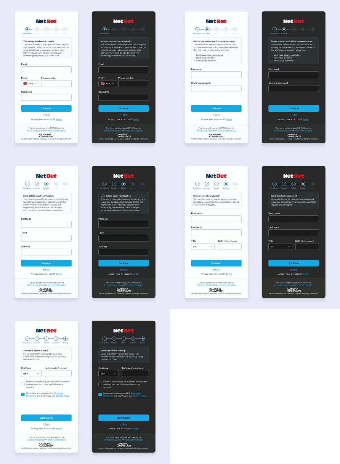
The design was minimized to create a more pleasant experience for the user.
The registration steps were added at the top so that users can easily track their progress.
A constant information panel was incorporated to guide users through each step of the registration process.
Intuitive Navigation: The "Continue" button remains in the same position to reduce cognitive load, making the experience more intuitive and fluid. Users are also provided with a "Back" option and a prompt for those who already have an account to log in.


Bet AI
Bet AI
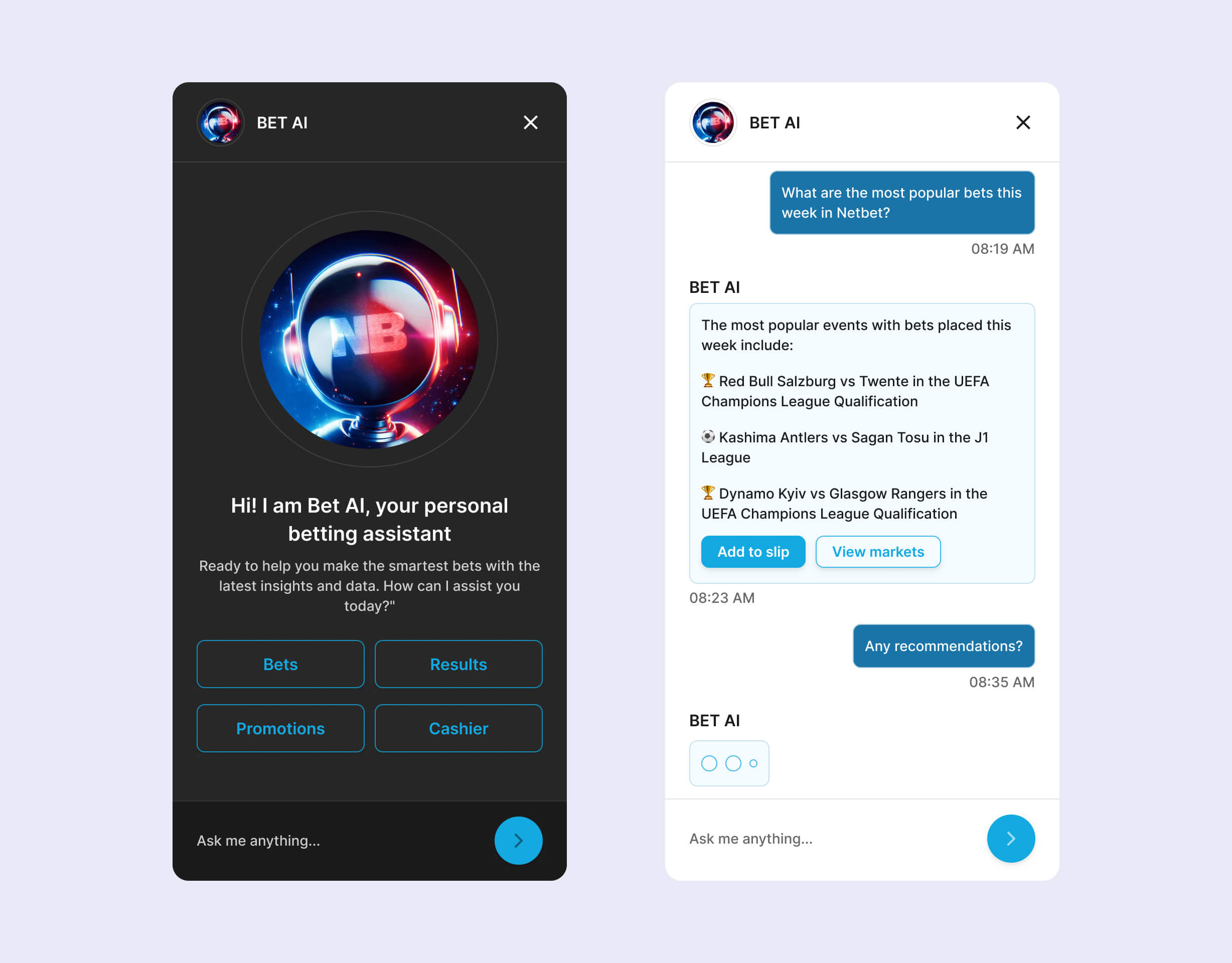
Creation of a unique design for the assistant to give it personality and a sense of familiarity.
Easy access to frequently asked questions to quickly address common user concerns.
Simple chat interface with agile communication for efficient interaction with Bet AI.
Links to bets and events within responses to drive higher conversions.
Personalized recommendations based on user preferences and past activity to enhance relevance and engagement.


Bet Slip
Bet Slip
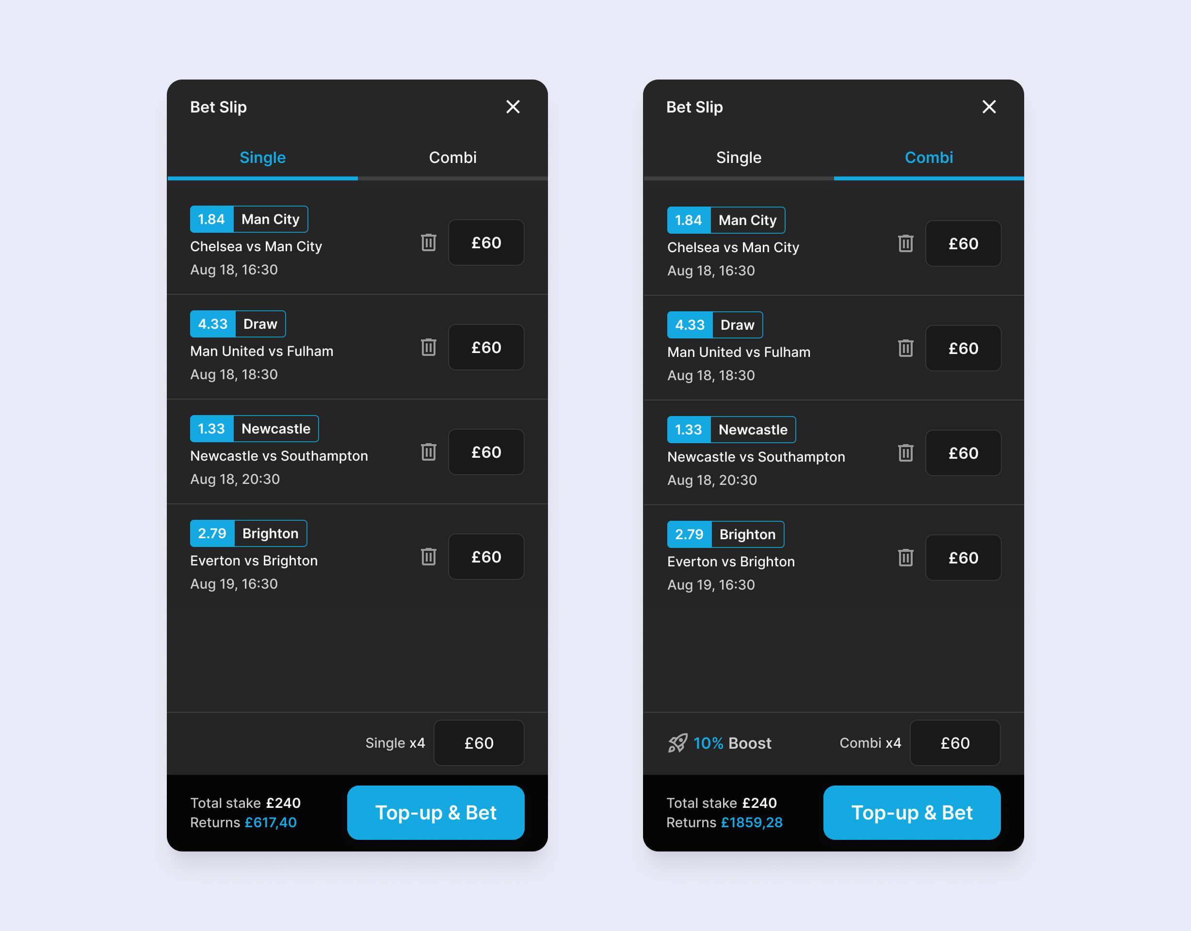
Redesigned Bet Slip pop-up for easy access and user focus.
Reduction of unnecessary elements on the screen to maintain a clean and efficient interface.
Highlighting created bets to facilitate user verification.
Alignment of all inputs to enhance user cognitive ease.
Improvement of displayed information with appropriate contrasts for better readability and emphasis.
Artwork
Artwork
Acquisition
Acquisition
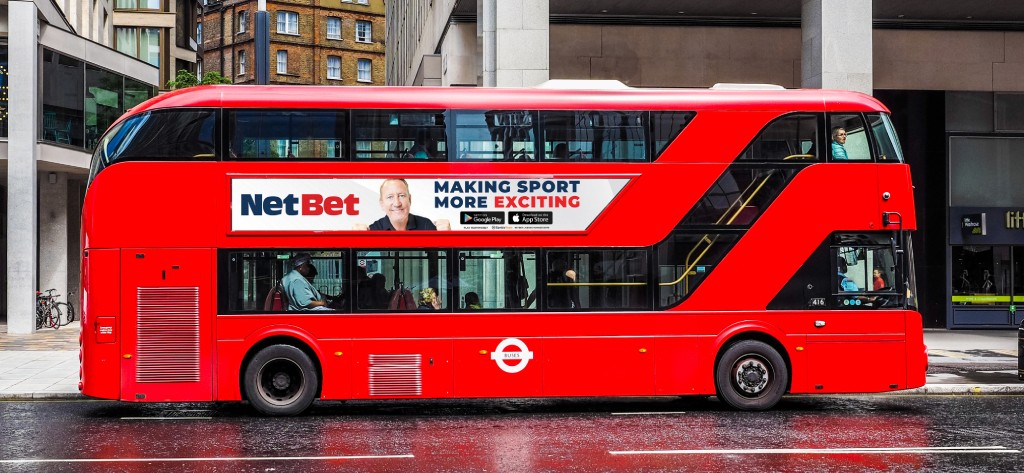
High-impact visual elements are crafted for acquisition campaigns, focusing on striking design and high-quality composition. These efforts enhance brand appeal and conversion rates, ensuring the platform stands out in the competitive sports betting market.
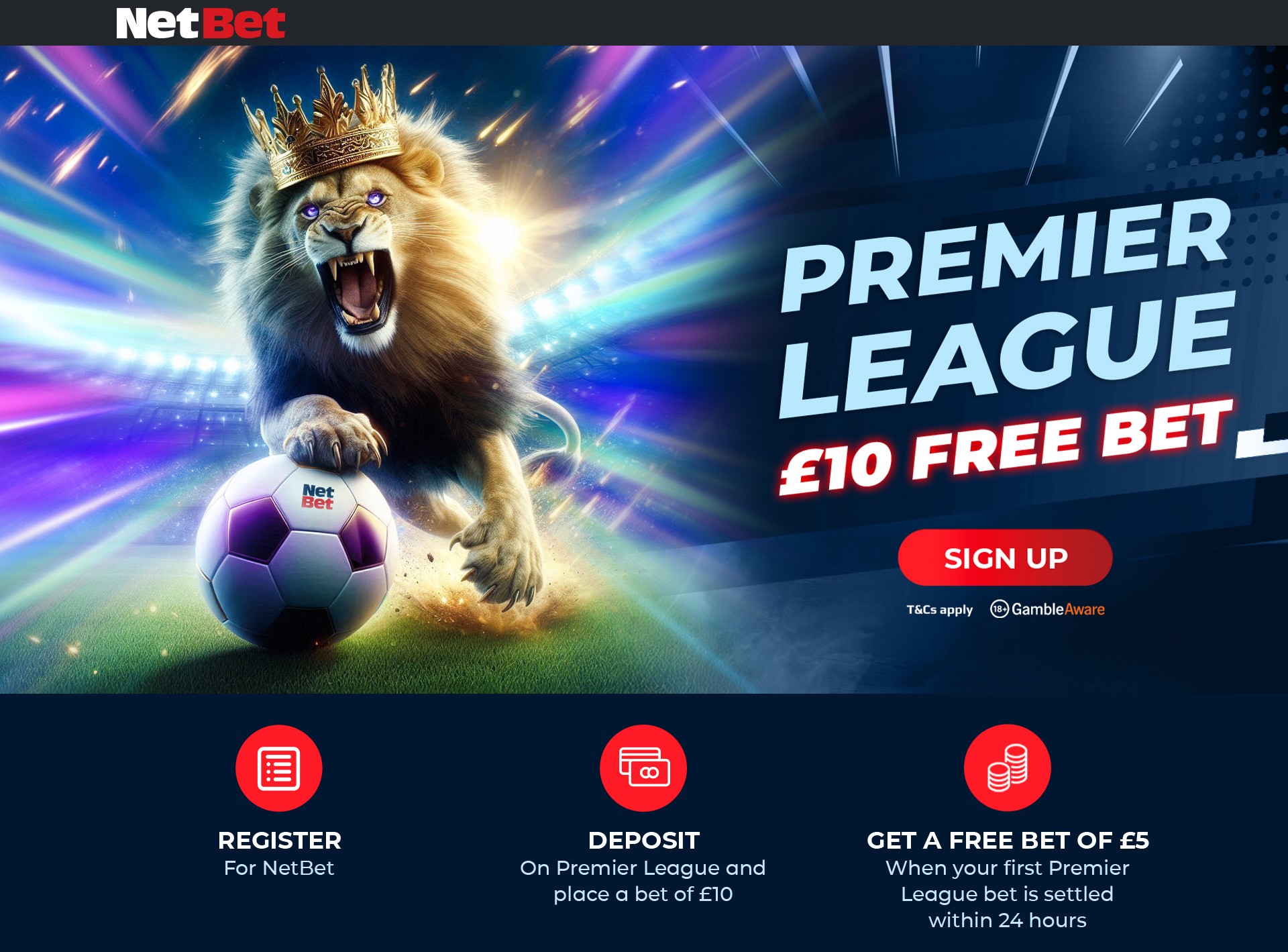


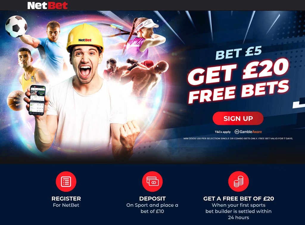





Development of multiple high-impact OOH campaigns for NetBet, effectively targeting audiences both in the UK and across international markets.


UI Design

Working with variables
Consistency Across the Platform: The new button scheme ensures a uniform look and feel.
Established a clear hierarchy for buttons, with primary for key actions, secondary for supportive tasks, and tertiary for less critical options, aiding user decision-making.
Neutral and Destructive Actions: Introduced distinct tones for neutral and destructive actions, ensuring users can easily differentiate between regular actions (e.g., canceling) and critical actions (e.g., deleting), reducing the risk of accidental actions.
Improved Accessibility: The button scheme has been designed with accessibility in mind, featuring high-contrast color options and clear labeling to ensure all users, including those with visual impairments, can navigate the platform effectively.

Redesigned buttons
Consistency Across the Platform: The new button scheme ensures a uniform look and feel.
Established a clear hierarchy for buttons, with primary for key actions, secondary for supportive tasks, and tertiary for less critical options, aiding user decision-making.
Neutral and Destructive Actions: Introduced distinct tones for neutral and destructive actions, ensuring users can easily differentiate between regular actions (e.g., canceling) and critical actions (e.g., deleting), reducing the risk of accidental actions.
Improved Accessibility: The button scheme has been designed with accessibility in mind, featuring high-contrast color options and clear labeling to ensure all users, including those with visual impairments, can navigate the platform effectively.

User panel
More elegant, organized, and intuitive design to enhance visual appeal and usability.
Search feature within the panel to help users easily find answers to their questions or navigate the panel.
Implementation of a notification system with direct access to support to keep users informed and enable efficient problem resolution.
Additional information panel to guide users and provide relevant assistance and details during their use of the panel.
Highlighted balance for clearer and more effective control over their account and funds.

Registration form
The design was minimized to create a more pleasant experience for the user.
The registration steps were added at the top so that users can easily track their progress.
A constant information panel was incorporated to guide users through each step of the registration process.
Intuitive Navigation: The "Continue" button remains in the same position to reduce cognitive load, making the experience more intuitive and fluid. Users are also provided with a "Back" option and a prompt for those who already have an account to log in.

Bet AI
Creation of a unique design for the assistant to give it personality and a sense of familiarity.
Easy access to frequently asked questions to quickly address common user concerns.
Simple chat interface with agile communication for efficient interaction with Bet AI.
Links to bets and events within responses to drive higher conversions.
Personalized recommendations based on user preferences and past activity to enhance relevance and engagement.

Bet Slip
Redesigned Bet Slip pop-up for easy access and user focus.
Reduction of unnecessary elements on the screen to maintain a clean and efficient interface.
Highlighting created bets to facilitate user verification.
Alignment of all inputs to enhance user cognitive ease.
Improvement of displayed information with appropriate contrasts for better readability and emphasis.
Artwork
Acquisition
High-impact visual elements are crafted for acquisition campaigns, focusing on striking design and high-quality composition. These efforts enhance brand appeal and conversion rates, ensuring the platform stands out in the competitive sports betting market.


Development of multiple high-impact OOH campaigns for NetBet, effectively targeting audiences both in the UK and across international markets.

